CASE STUDY OCT 2020 (41 hours)
Clutch - HackTX 2020
A social good app that engages college students within their community
and serves as a platform to support one another during the COVID-19 global pandemic.
Context
My team for HackTX 2020 consisted of two back end developers, one front end developer, and myself, as the UI/UX designer. We tossed around several project ideas in relation to the prompt given by Microsoft, one of the sponsors, which was to create an app with a positive impact that addresses a need in society. Due to the global pandemic and social distancing regulations, many people want to minimize their outdoor exposure and socializing, leading to increasing rates of mental illness. We wanted to create an app that would aid college students in feeling more engaged within their community, friends, and family by helping out fellow community members who are in need of help or who may not be comfortable going out for day to day tasks.

Problem Statement
How might we elicit feelings of connectedness through social good to reduce loneliness and negative emotions during the COVID-19 pandemic?
Who are our target users?
We established our target users as college students, people who we could really empathize with and understand. I created two user personas to align the team on who we are designing for.
User Personas
User Journey Map
Although there was limited time, I created a journey map to understand and envision the flow for one of the main use cases. User A (Ashley) is asking for help and for User B (Tim) accepts the request from User A.
User Journey Map

UI & UX Design
Once we established our target user group and created use cases, I started designing wireframes. Due to the time constraint, my team and I agreed that the UI had to be simple and straightforward in order for the front end developer to finish in time.

Login/ Sign Up Page
I wanted the user interface for the login / sign up page to be appealing and inviting. Blue is typically associated with tranquility and calmness. Adding an accent of yellow in the logo puts forth a sense of positivity and joy, which are emotions we hope to enhance in our users.

Home Page - Help someone in your community
I decided that a list UI would be the best way to optimize scannability and summarize content, yet still provide a simple design for the front end developer to fulfill. I studied UI components of successful apps like Spotify and WhatsApp and how they integrated a “list” display, since that would be important for user’s interaction in terms of accepting requests for help.

Details of Request for Help
The user is able to click on one of the list items from the home page to view more details about the request for help such as time preference for delivery and locations to pick up the requested items. They can either accept to help the person or go back to the home page.

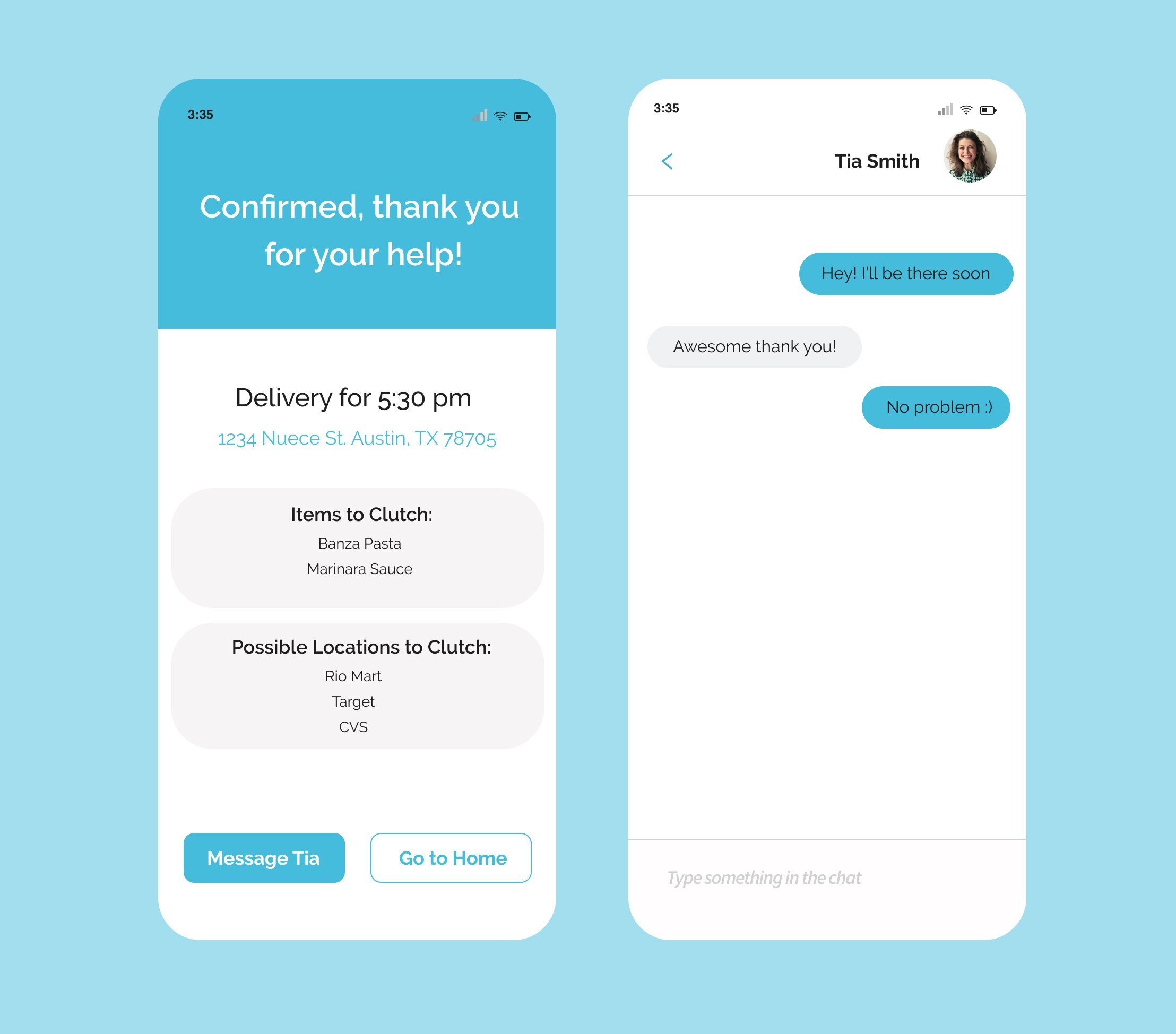
Accept Request for Help
Once the user accepts a request for help, they have the option to be able to chat with the other person who requested for help.

Ask for Help
The second option in the bottom navigation bar allows the user to ask for help by filling out the respective details.

Activity
The third and last option in the bottom navigation bar displays the user’s activity in the app. I made sure to maintain the list UI that was seen in the Home Page.
Takeaways
As my first hackathon, I gained valuable exposure in terms of working with developers in order to create a well designed application. Even though our team was not able to bring everything we envisioned to a functional prototype, I learned a lot about how an app is built and the importance of collaboration and proper communication among team members to successfully meet goals.
Thanks for reading!


